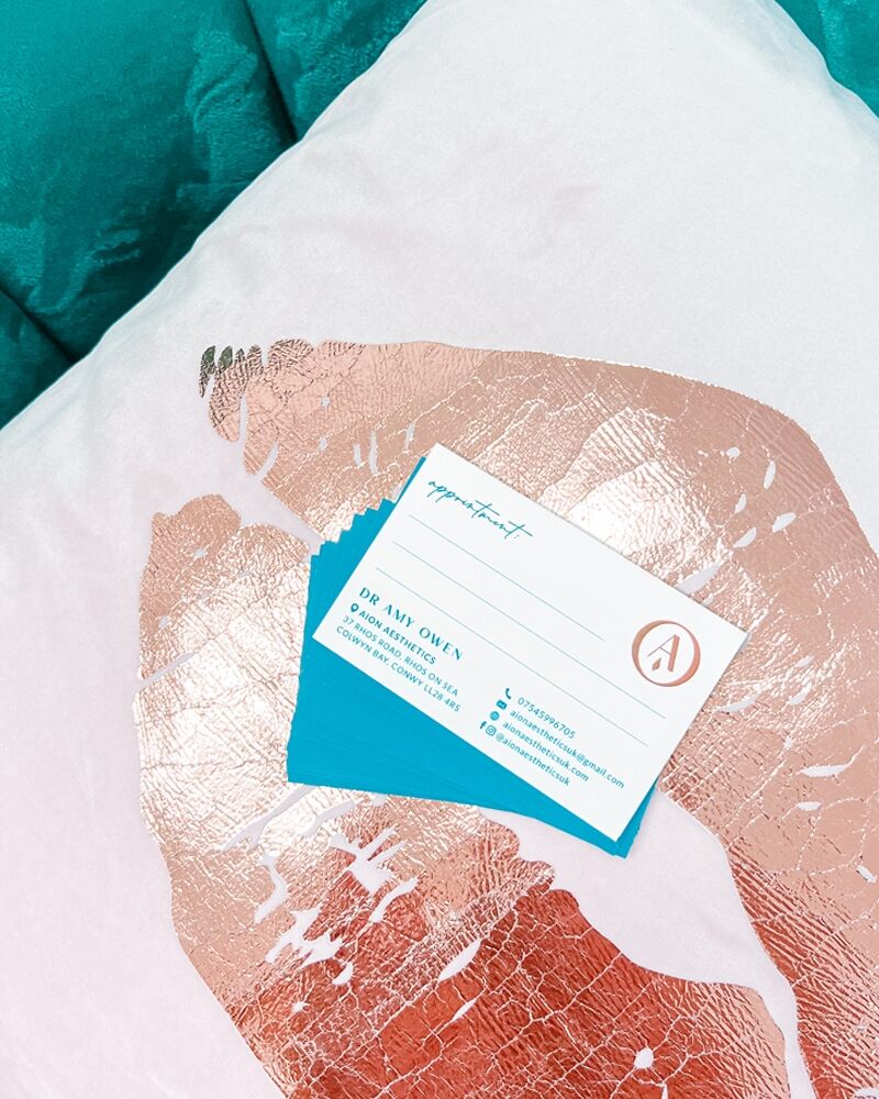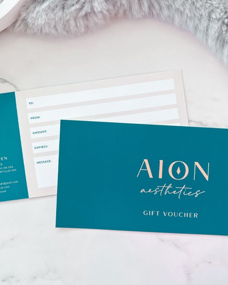
AION Aesthetics
The Brief
Design a brand identity for Amy, the owner and sole practitioner at AION Aesthetics. Logo, colour palette and supporting assets need to feel premium, professional but also friendly.
Amy offers a professional aesthetics service. She is a fully qualified Emergency Medicine Doctor and has worked in A&E both here in the UK and Australia. She is highly experienced and has the anatomical and scientific knowledge of how the body works and responds to treatments, giving her the skill to carry out natural looking, cosmetic enhancement procedures. She is also a great friend and a superwoman.
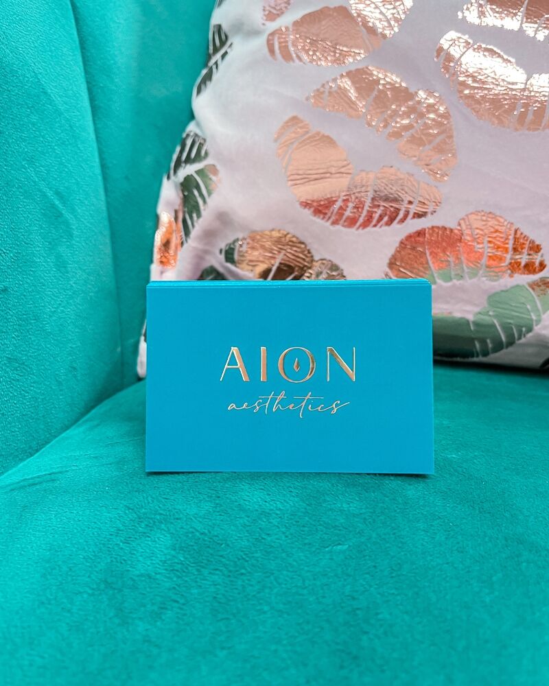
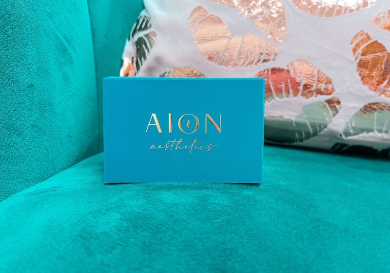
In developing the AION Aesthetics logo, I incorporated a script, lowercase, handwritten font that Amy was keen to feature and paired it with a custom uppercase serif. The ‘aesthetics’ font is feminine, lightweight, fluid and classy whereas ‘AION’ needed to have prominence, legibility and impact.
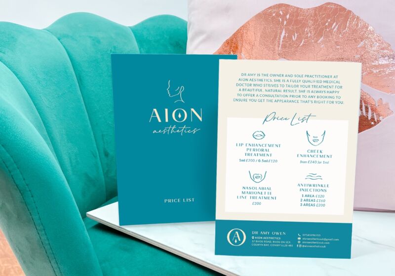
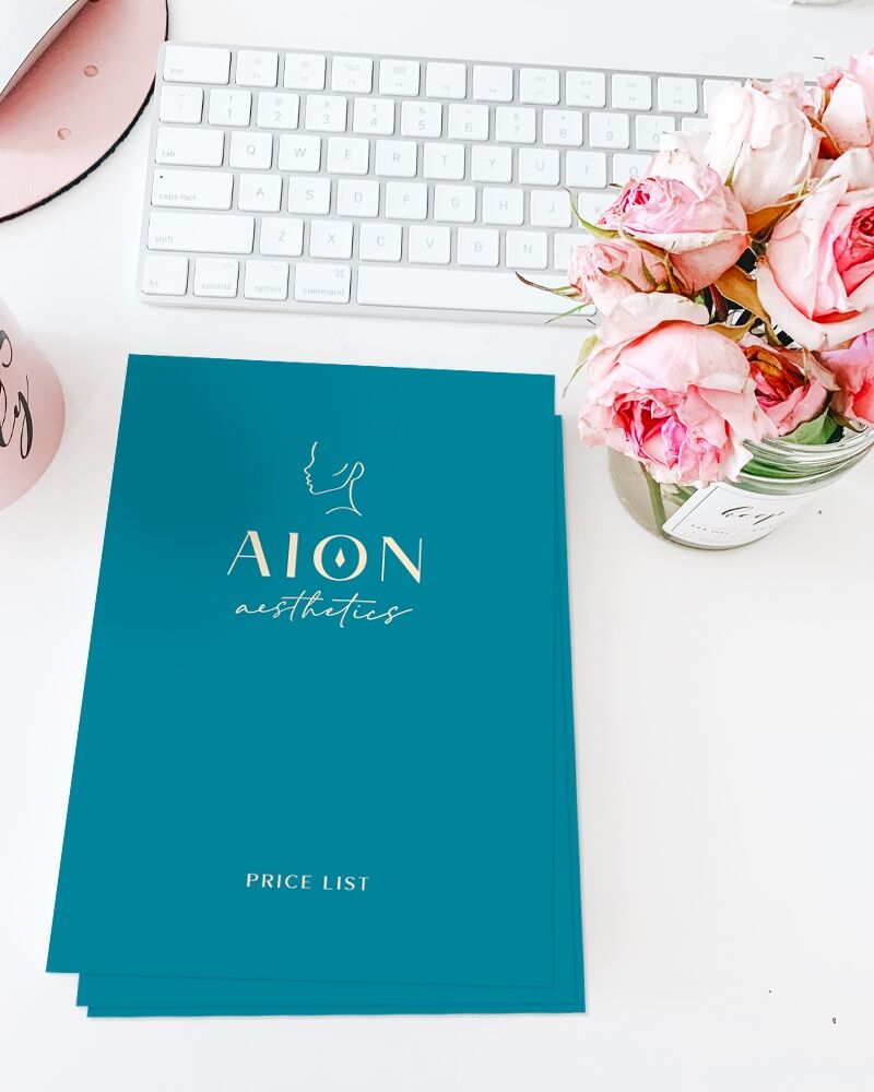
There is a diamond droplet in the centre of the O in AION, referencing the liquid injectables used in the procedures - drops of youth! We wanted to steer clear of using any obvious illustrative use of needles or syringes and rather subtly hint at the treatments on offer. This is made clearer with an additional illustrated mono line facial profile which can be used above the logotype in certain circumstances where space allows, however not appropriate in every instance. Further illustrative assets were created to highlight various treatments on printed price lists and social media.
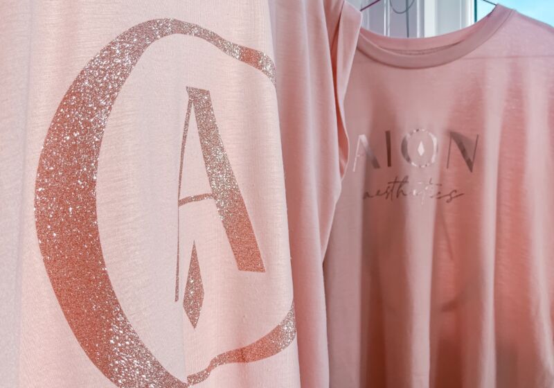
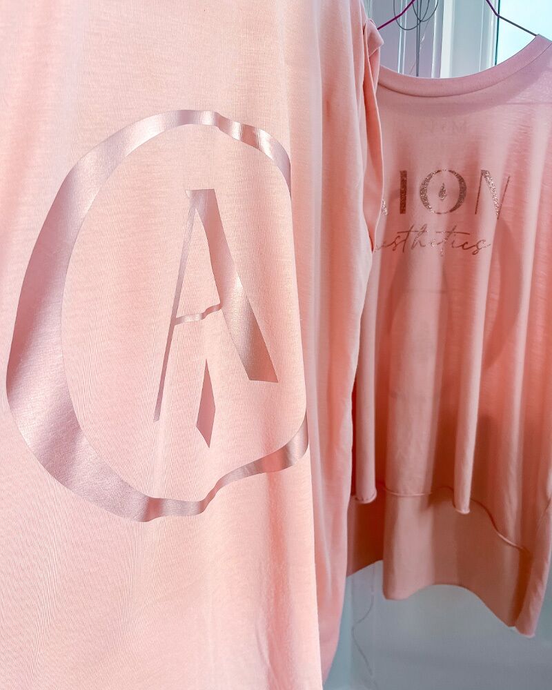
An icon which combines the O and the droplet alongside the A is a useful addition to the brand logo suite that can be used across all print and digital formats and also uniform. Amy wanted to ditch the standard clinic style tunic in favour of floaty, comfortable peach coloured roll sleeve t-shirts with rose gold glitter and metallic print.
