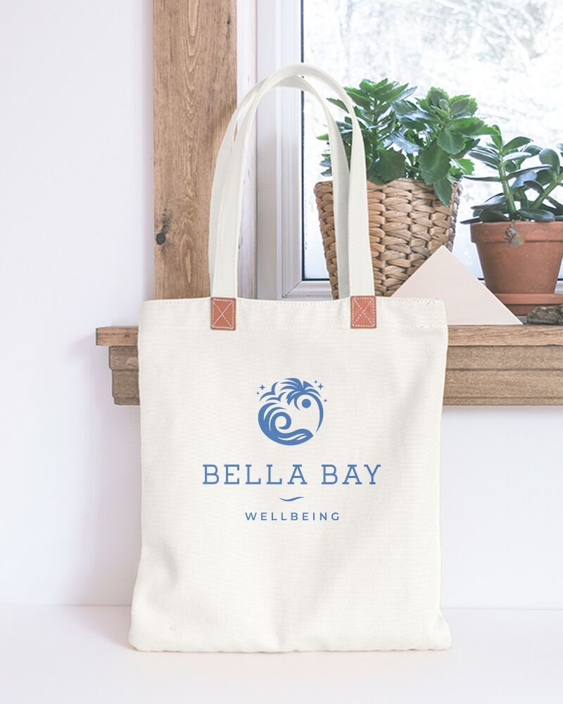
Bella Bay Wellbeing
The Brief
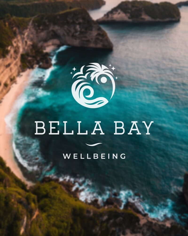
Branding for a new wellbeing company based at Y Shed in Meliden. Must have a sense of relaxation and calm. Would like to incorporate palm tree, waves and a yin and yang into a stand alone symbol.
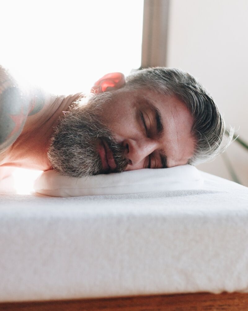
This location is beautiful, encourages relaxation and the feeling of being away from it all. Taking inspiration from working on the beach in Portugal, Bella Bay provides a range of treatments including relaxing Lomi Lomi (Hawaiian) and Cowrie shell massages. Ffion also treats ailments such as arthritis, sports injuries, and hormonal imbalances.
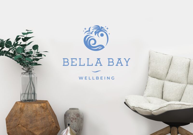
Ffion was clear from the start that she she wanted to develop an icon to go with the logotype that combined a palm tree, waves and a yin and yang. The yin yang dots can be seen in the negative space within the eye of the wave and the sun under the palm tree. The shape of the wave and the curve of the palm tree also hint at the yin yang symbol. The sparkles add to the feeling of peace and serenity and the birds, freedom.
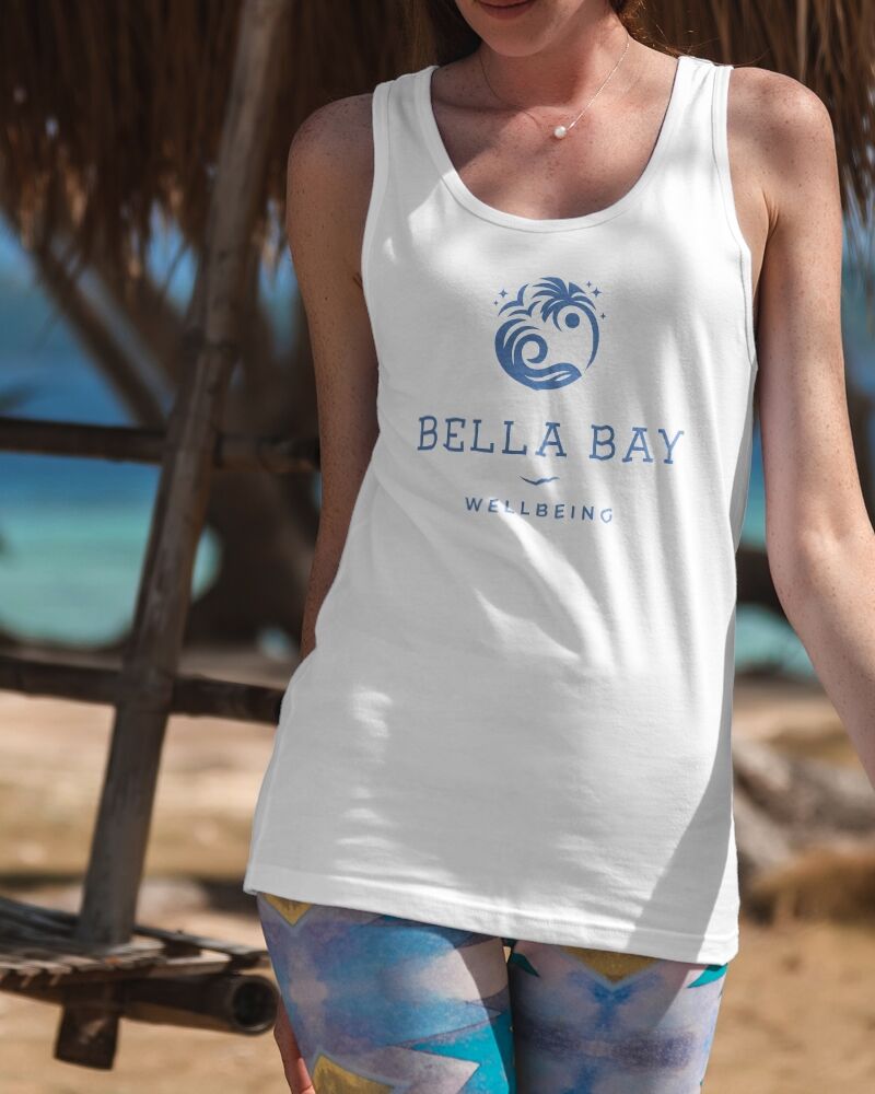
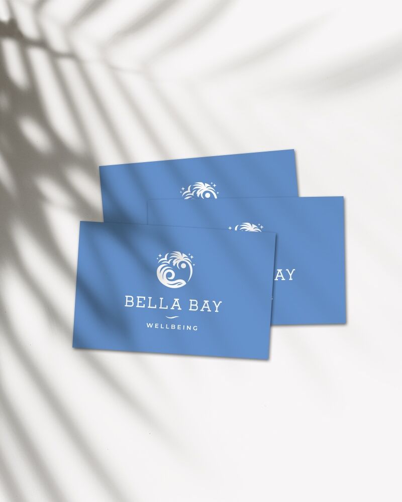
I wanted the colour palette to feel fresh and breezy and enough space around the logo for it to breathe and not feel too cluttered.