Coco Cymru
The Brief
Independent fashion boutique based in South Wales. Plans to stock green/sustainable brands but absolutely nothing BORING! Stocking mostly scandi labels, think… all the colour, all the prints, all the textures, all the clashing and all the attitude.
Well, to start things off, this client would have got a 10/10 for briefing. Good grief, this girl knew exactly what a designer would need to nail the style she was looking for. After getting to know her better over time, it seems we have very similar taste in style, fashion and homeware - hello dream electric blue SMEG fridge!
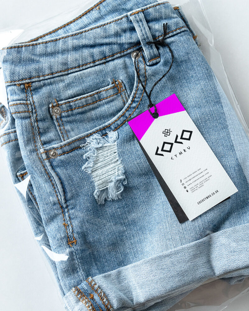
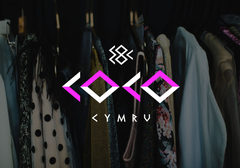
Mood boarding was a self indulgent treat for me. I knew that 'CoCo' needed to be prominent as she was thinking of dropping 'Cymru' at some point down the line. I created a bespoke type face which is bold, edgy and confident. The strap line is 'Pretty Meets Punk', therefore, sharp angles felt appropriate to portray the attitude the client was looking for.
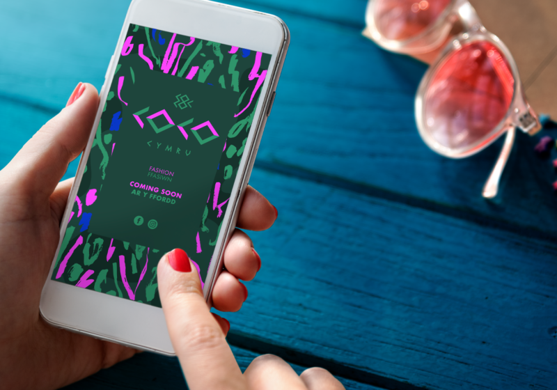
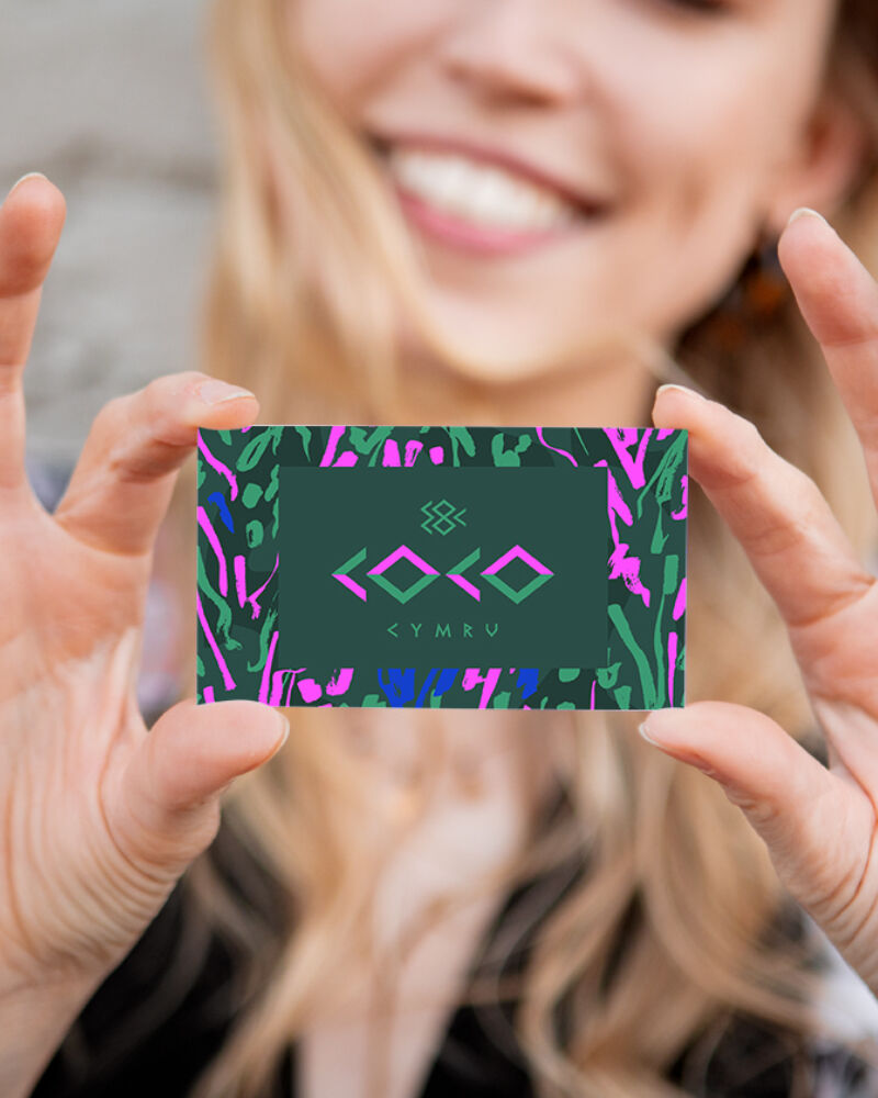
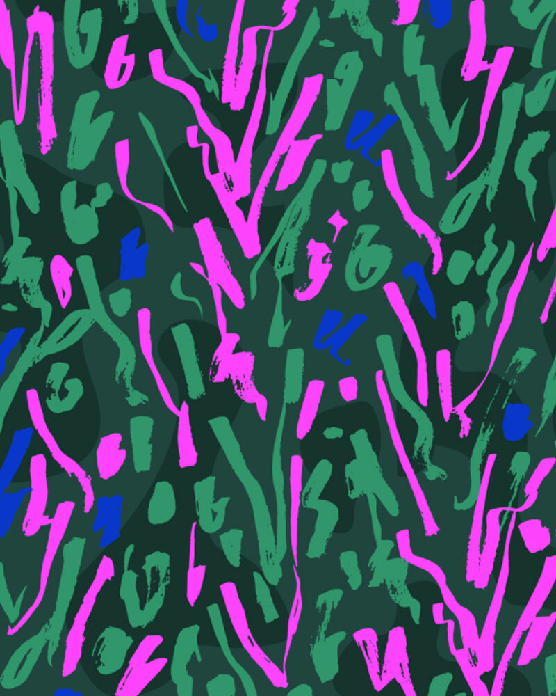
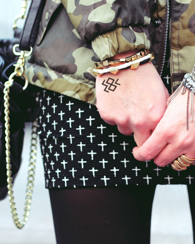
I created an icon that can be used alongside the main logo but can be used stand alone also. This is made from a stacked version of the 'CoCo' logotype and the 'C' from 'Cymru'. I also designed a pattern that is used as a background of her website and also on her business card. This client was never going to opt for a minimal, less is more business card layout when you can have a full bleed in your face pattern.
It's a shame all of the spangly leopard print catsuits and sequinned fringed festival jackets haven't had a chance to shine this summer with the Covid19 restrictions. Although, I have a sneaky suspicion Catrin may have worn those outfits whilst home schooling and doing P.E. with Joe, regardless?!
