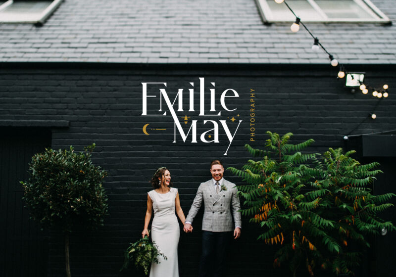
Emilie May Photography
The Brief
Branding for a Wedding photographer based in Lancashire. Theme - moon/stars related. Go bold with the text incorporating the theme somehow, with the focus being the typography. Colours - Forest green, deep teal and gold. Steer clear of anything related to weddings or that look too corporate. Appeal to creative & edgy clients.
GOSH! I was itching to get started on this as soon as the brief landed in my inbox. Emilie even added me to a Pinterest board that she had created which included some lovely sophisticated typography, ‘Gypsy teal’ paint swatches and even some vintage moon drop earrings that actually gave me over-excited palpitations.
I went for the main emphasis on her name with the customised serif type and paired a simple sans serif ‘photography’ as a secondary element. Emilie wanted something playful with characters interacting whilst still remaining legible. I created some little moon and star assets that could sit with the logo type that really bring together the cosmic vibe that Emilie was looking for.
Once the main logo was finalised, I created a monogram with the EM and supporting graphic elements that Emilie could use as another option where appropriate. Currently it is used on the header banner of her website, giving a stripped back, clean and minimal space for her beautiful photography portfolio to shine.
All photography used is her amazing work. She certainly is a talented lady.