Fruit Nomads
The Brief
Branding plus a series of pattern assets for package labels. Fruit Nomads - The new taste adventure, air dried fruit with added salt and spice, infused with a citrus tang - a punchy little snack that delivers on taste. Styling must appeal to core demographic, stand out and look bold and quirky.
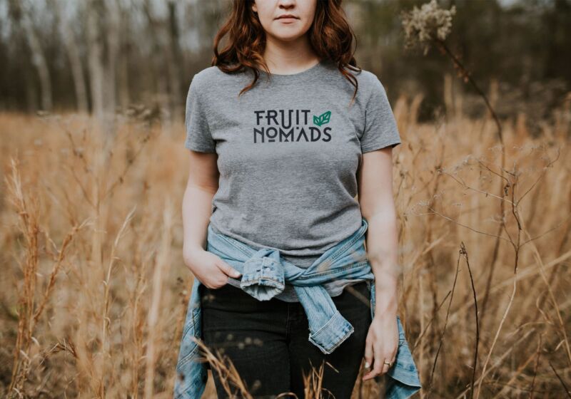
Agency: View Creative AgencyUsing the letters of 'Fruit Nomads', I went about creating a bespoke typeface, with multiple quirky features and unconventional characters. I felt this was the right direction for the logo given the nomadic notion of nothing being too fixed or formulaic. I kept the weight of the line bold but not too chunky and added a small geometric leaf icon in the top right that can be used stand alone where appropriate. The icon strengthens the natural element of the product, with fruit being the main ingredient of the snack packs.
The patterns were created to distinguish the 3 different flavours with ethnic touches and colour palettes. 'Chilli, Lime & Sea Salt' has Mexican vibes whereas 'Chaat Masala' more Indian and 'Sichuan Pepper & Ginger' more Chinese in style. These patterns run along the bottom of the front of pack labels and sits alongside a colourful, angular block holding device for the content.
The colourful labelling, combined with the bold and experimental logo fits the brief, the client and the fantastic product. Who knew salt and spice on fruit could be so delicious!