Kate Jones Millinery
The Brief
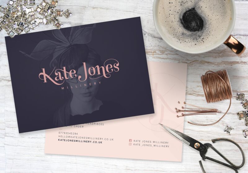
The Kate Jones Millinery brand needs to be simple and classic and promote a sense of luxury. Key clientele are Mother of the bride with the intention to also target the bridal and formal ‘day at the races’ market. A colour palette of deep navy with dusky pink and rose gold for a feminine, contemporary feel.
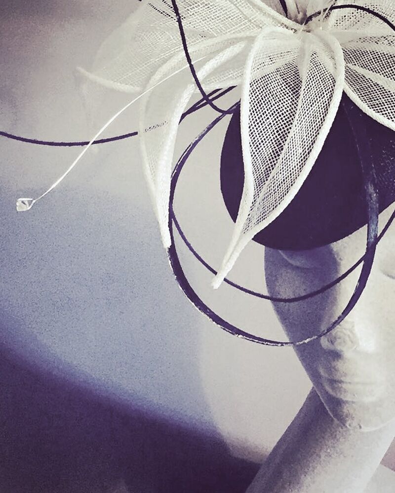
This girl is so good at what she does and it seems so effortless. She can whip up a masterpiece which oozes sophistication and glamour with an ability to range from extravagant to understated, tailored to suit her client, using a broad range of experimental materials. Kate has even created pieces using wood (oak, cherry and mahogany) managing to eliminate the masculinity that can often relate to wood, using smooth textures and lightweight curved lines, helping to capture the subtle feminine form. I thought this was key in developing Kate’s brand mark. The letterform needed to reflect this feature of her work, the fluidity of the structures she creates that has become her signature style.
The logo is flexible as it works both landscape and stacked, depending on the environment it needs to work with. I have also designed a simple monogram motif using the KJ which can be used on social media profile pictures and stickers and which appears as a faint watermark on the reverse of the postcard.