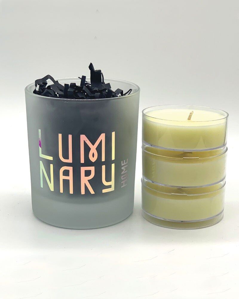
Luminary Home
The Brief
Branding and pattern design for a start up candle company. Really keen to play on the light and dark with the look and feel of our brand. Love bold, clashing, bright, neon colours and leopard print patterns. We want to be in your face. No script fonts or bland design.
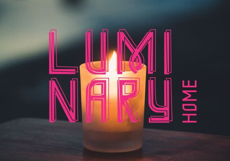
I started this project looking at the fragmented nature of candle light, the way things flicker and distort. I created bespoke typography that features slightly warped and uneven characters.
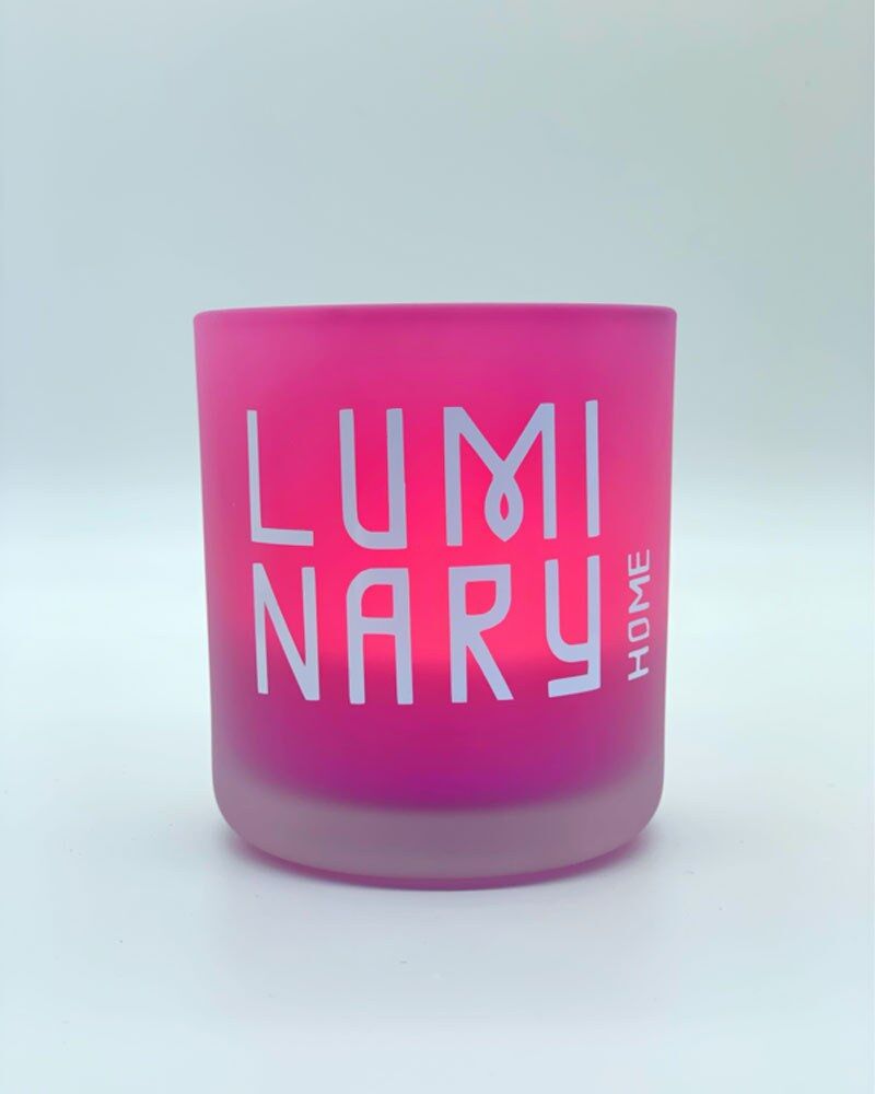
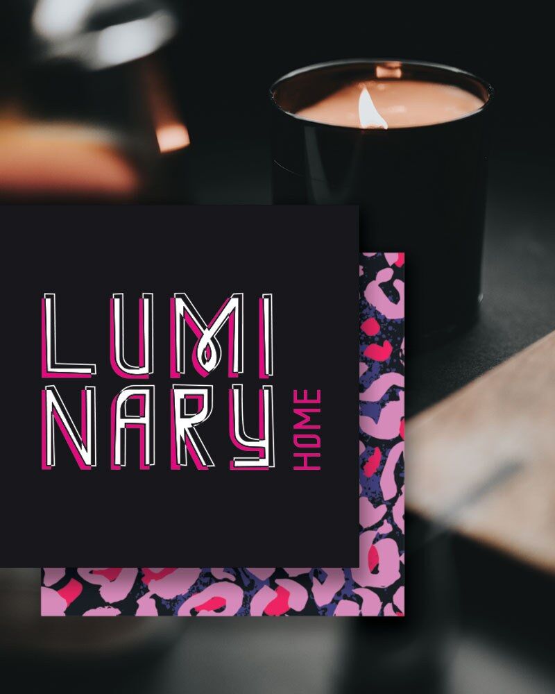
The solid type is combined with a coloured over-line that is imperfect and wonky, intercepting the main letters and splitting up the characters, illustrating flickering light. This was ideal for colour play with different clashing colours and highlights, something the client was eager to explore. The primary colour palette is monochrome, playing with the light and dark theme but with flashes of bright colours.
The word 'Luminary' itself is split up and stacked, with the M integrating a teardrop looped flame. This projects welcomed fun typographical exploration, a designers dream.
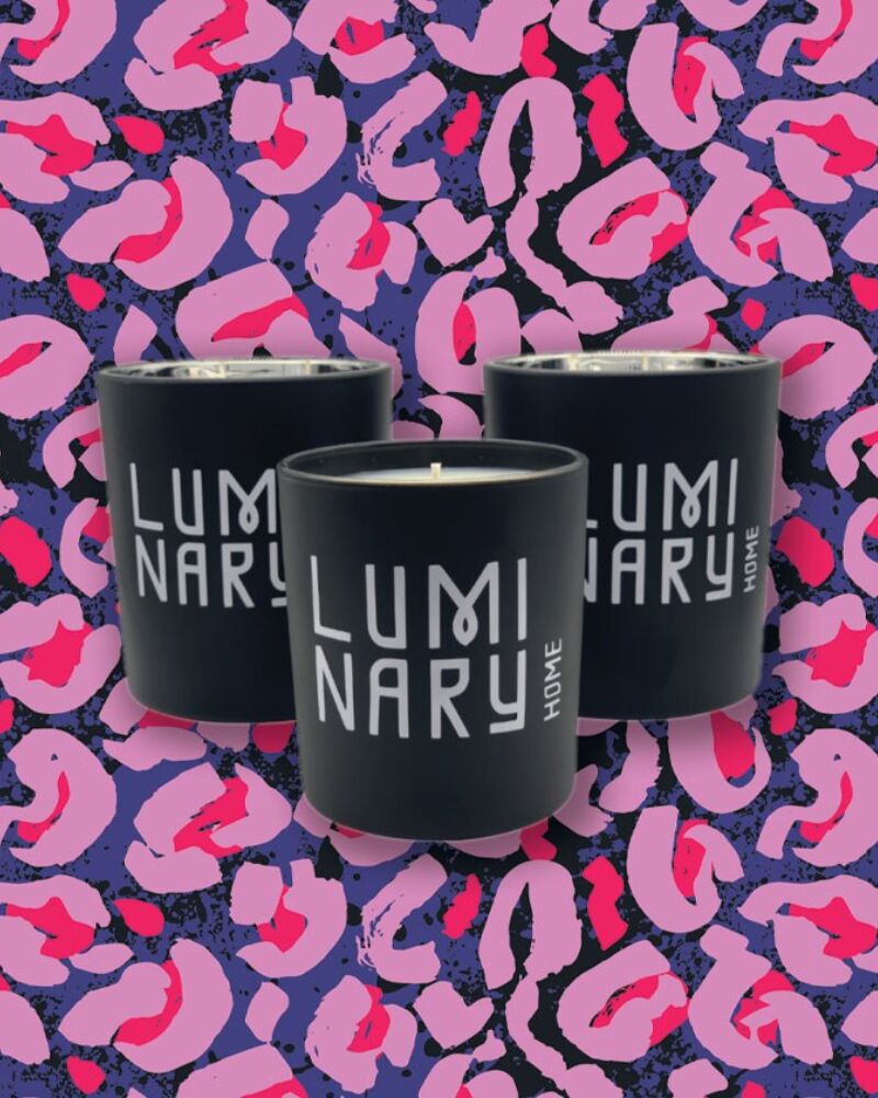
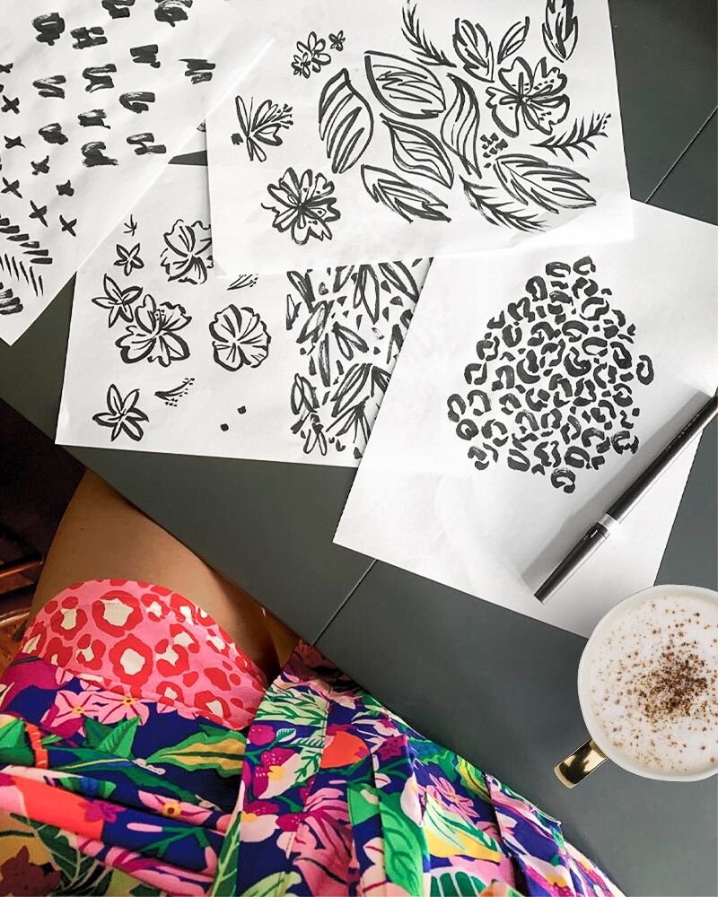
I created a suite of patterns using clashing colours, free hand mark making using Japanese brush pen and ink and then digitalised and made into repeat patterns to use on labels, boxes, backgrounds and more.
The end result is a quirky, creative and in your face brand and different from other brands on the market.