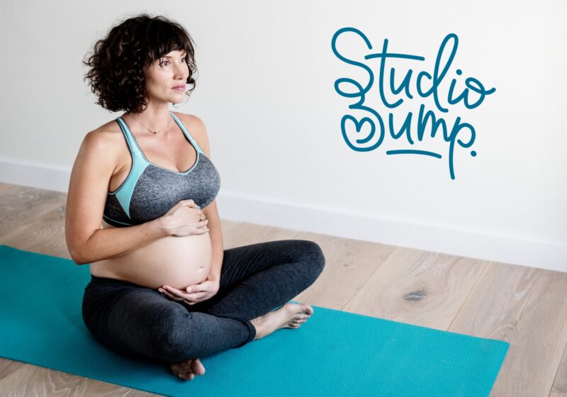
Studio Bump
The Brief
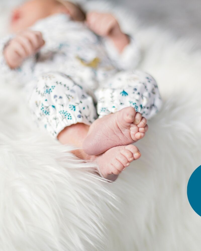
Brand redesign for a business collective. Services and classes for expectant and new mothers. Offering pre and post-natal classes, maternity, new born and baby photography plus a host of other services in a friendly, peaceful environment. Logo needs to reflect the space and be non gender specific, possibly using both blue and pink.
When Abie and Laura approached me to work on their branding, I was so looking forward to get going. I first met Abie when I was going to a yummy mummy fitness class. She's such a fab photographer as you can see for yourself: Precious Memories. Her photos of my girls take pride of place on my living room wall. I had a new born shoot with her when my daughter, Willow was only a few days old.
The main studio space, the treatment room and the relaxation room at Studio Bump are perfect for small-group exercise classes, workshops, relaxation and meditation sessions, baby classes and more. Ideal for holistic and alternative therapies, including massage, reflexology, reiki, hypnotherapy, acupuncture and beauty. The space is light and airy which makes for a really comfortable environment and one that I wanted the logo to reflect.
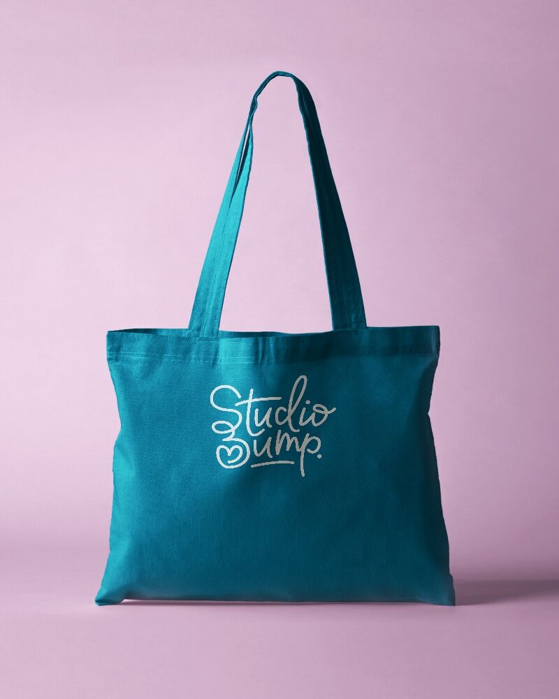
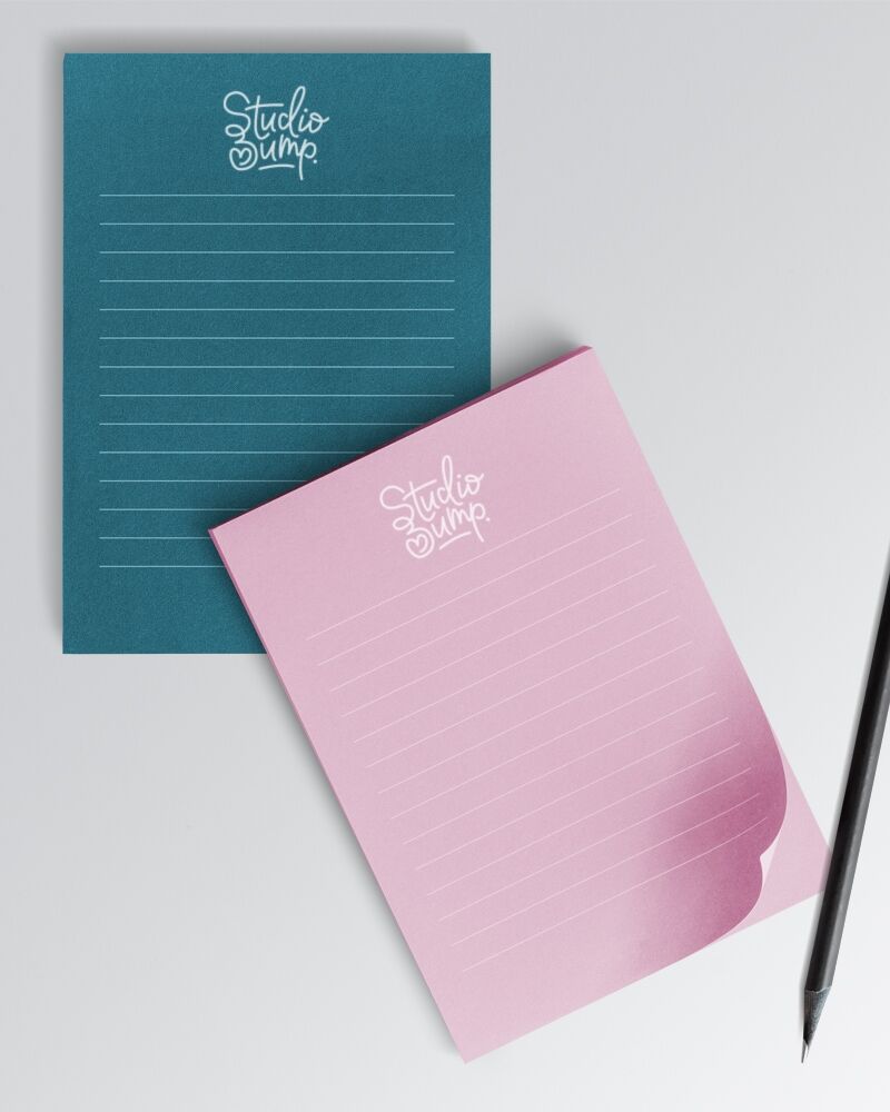
I went for a clean/modern monoline approach for the Studio Bump logo. The line is joined up and fluid, showing the 'connected' nature of the businesses - all the services offered in one place. The bespoke freehand lettering is friendly and feels approachable. The B of Bump is a stylised profile of a pregnant silhouette and a heart within the bump.
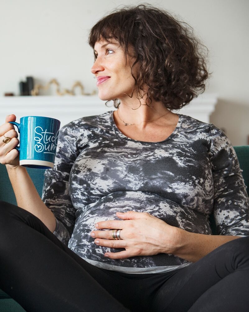
The SB and heart can be used as a stand alone graphic for stickers or social media profile picture. The colour palette uses a turquoise blue with a soft dusky pink. It's not too girly or too masculine and also isn't too babyish as it's aimed at Mothers and doesn't need to be cutesy or infantile.