Walia Bach
The Brief
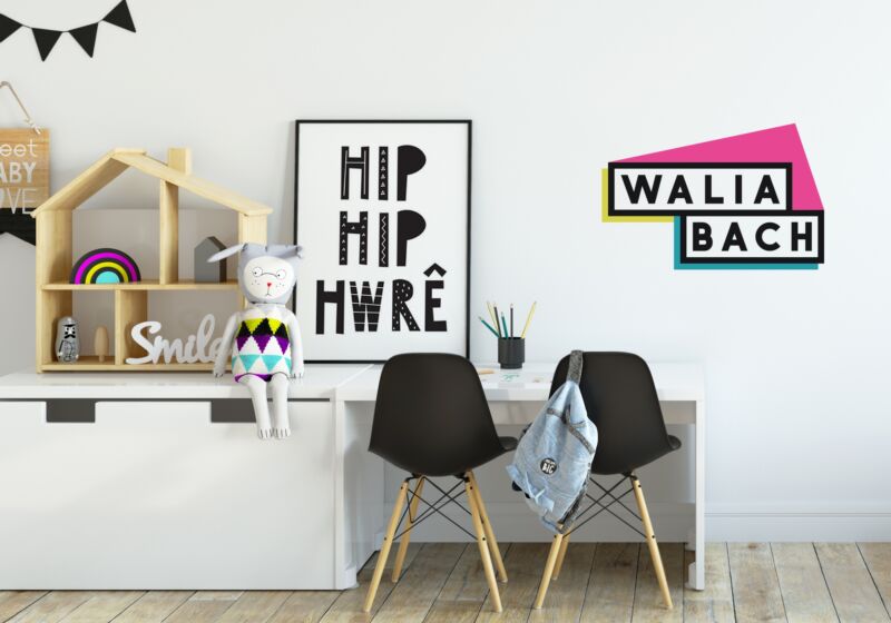
Branding for Walia Bach who design Welsh prints for the home. The name translates to two meanings; Little Walls and Little Wales. Client requires something clean, bold and minimal to compete with other cool-insta interior print sellers. Require a colour and mono version of the logo.
I was contacted by Elin from Walia Bach to update the branding that she had created when she initially setup the business. Elin is a mum of 3 boys and started her business while on maternity with her youngest. She was struggling to find any scandi style monochrome welsh prints for her own home so decided there was a gap in the market and began designing her own.
When it came to updating the logo 16 months later, Elin found that incorporating a house into the logo made it look like a construction company or estate agent rather than home interiors. She didn't want it looking too grown up or too childish either as her prints range across all ages. She wanted something cool AF (her words!).
We explored 3 avenues but quickly found that a really simple bold sans serif font would be the best option. We wanted the Welsh words to be easily readable by English speakers. I tied this in with a frame around the letters in the same thickness to reflect the nature of the business being framed wall art. I also integrated a subtle asymmetrical pitched roof to reference the home. The colour palette is based on the CMYK (cyan, magenta, yellow and key) printing process, again referencing the print aspect of what the company produces.
It was a joy to work on this project and If I could rate a client for how lovely they are to work with and how spot on they were in terms of briefing and feedback, this client gets an A*.